Intermittent Explosive Disorder (IED) is a disease defined by uncontrollable anger and rage, racing thoughts and other exaggerated, abnormal behavior.
Science and medical information only provides symptom descriptions for this disease, and sufferers have basically no chance to solve it. Only psychiatric medication is well-known to improve it to some extent but can have strong side effects and does not solve the cause.
IED destroys families, relationships and probably even lifes. It’s considered a rare condition, but with an estimated lifetime prevalence of 3-5%, it seems not rare at all (for comparison: ADHD is estimated at 5-10% and considered a widespread syndrome nowadays). Guess the impact that a permanent solution could have, even if it only works for a subset of affected people. I found an easily-explainable solution that worked for me ‒ mostly the dietary change of leaving out histamine-rich food items.
Table of contents
- My story
- Development of the disease
- Detecting IED in yourself
- Medication and optionally therapy can be a good first step
- Measuring symptoms to find the cause
- Histamine intolerance (HIT) is the cause, omitting histamine-rich food items the solution
- What comes after the anger is solved?
- Related thoughts and reading
My story
…won’t be detailed very much here. It doesn’t matter for resolving the illness, and I want my privacy after all these years of fighting and not knowing what’s going on. The goal of this article is to help others. There are many stories online to read and watch, even scientific case reports, in case you’re unfamiliar with how the disease can present behavior-wise:
-
Videos about someone’s experience with IED incl. self-harm, pet harm, hitting walls and other people, strong anger outbursts. Got better with medication. Disappointments, loud noises or getting touched mentioned as main triggers. Relation to autistic traits.
-
Description from someone about her boyfriend and what she did to help. On the other side, most IED stories online can rather be summarized with recommendations like "leave that person". This disease easily destroys family ties if untreated.
-
As already mentioned in the above links, there are hints about anger symptoms relating to ADHS and autism. For instance, try searching for "anger" on r/ADHD and lots of posts will pop up.
-
Case reports of Mayo Clinic patients (dated 1987), mostly clinical severity
-
One study correlates road rage incidents, aggressive criminal acts and other actions with IED (full text not available)
-
Not about IED, but this r/Anger post reveals various scary stories of what people do while their brain is in anger mode
Another health topic on a software engineering blog? Yes, normally such a switch of topics is unexpected because those computer freaks only write about their stuff. Unless health problems take over your life, you develop an analysis tool specifically to figure it all out, you become a hobby scientist and expert for your own health, ultimately find real solutions, and want to share it for the benefit of everyone out there. My analysis software, yet unpublished, again had an important stake in studying this problem, and below I’ll prove once more how important data analysis and correlations are.
Development of the disease
Intermittent Explosive Disorder didn’t really occur when I was younger. A few signs here and there when I got unnerved for small things, but overall it either didn’t "break out" yet, or wasn’t noticeable. My father had anger and rage outbursts ever since I can remember, and IED is said to possibly be genetic. I didn’t want to be like him.
I got clearer symptoms only at adult age. It’s impossible to say when this really started. Some problems at work annoyed me, particularly if others did stuff without taking care, resulting in me fixing the issues, for example, and I’d sometimes rant about it. This could however be explained as the perfectionism of a young engineer, or by the environment the company gave me. I left the somewhat-toxic environment at my own choice, switched companies and was good for a long time, but still, the same triggers could annoy me. Stupid drivers on the road would also upset me. I can’t say at all when road rage started for me, but I had it to a non-extreme extent, meaning I wouldn’t honk and shout at everyone, like some other people do. It mostly stayed inside my car. And then came family life and failing partnerships, creating strong social triggers for this illness. Yet, all my anger usually had a good explanation: stupid or ignorant people around me, bad relationships, a crying baby, inconsiderate drivers, clumsily forgetting where I had put my belongings in the apartment, things falling down or just "everything goes wrong today" kind of days, having to repeat myself when talking to others, and so on. I kept telling myself that it’s those triggers which caused anger, and didn’t think much of it.
There’s an important distinction to make here: IED presents as uncontrollable anger and rage. Probably every healthy person gets angry about something many times in their life, maybe even many times per week depending on the circumstances. The difference is that someone suffering from IED goes from trigger to rage in milliseconds and doesn’t have the capability to stop the bad behavior at the onset. Specifically, in your mind, you can’t choose an alternative behavior. There’s no time for it, and no other thoughts in your head at that time. You explode, shout, rage, misbehave, and the angry feeling in your gut ‒ sometimes felt literally ‒ might only go away after a few minutes or sometimes hours. I have no clue how and when the disease developed.
Detecting IED in yourself
You came to this article, so you already know or suspect that you or someone close to you has a problem. The first important part now is to know your triggers. I’ve listed a few of mine above. Also, you will likely have non-triggers, that is, bad situations which you can tolerate without getting angry. For me, I was mostly fine at work except for a few occasions, I never had problems among my friends, and my anger was rather in family situations and on the road. Triggers can vary a lot, but I guess the disease is the same.
Second, you need to find out if you have a normal level of anger, for example triggered solely by your surroundings, or rather anger that is uncontrollable, pathological anger, stemming from a mental illness that needs to be fixed in your body and appears even for the smallest issue. It’s super easy to always blame others, especially if you’re really behaving well with other people 80% of the time. But those 80% of time don’t matter if the remaining 20% are killed by your rage outbursts. Mind that it’s very much possible that other people in your environment treat you badly, making you angry, and you still can’t just state it’s only the other person. Try to deal with, and objectively look at, yourself, as you can’t change others. If your current relationship already got intoxicated by anger and stress, there’s always the chance in another one and sometimes things need a fresh start.
There seems to be no objective way to quickly determine if you have the disease. Nevertheless, read on to what my body’s problem and the solution was… you’ll see that anyone can try my dietary solution safely and thereby find out if bad behavior and outbursts turn back to healthy levels ‒ or go to complete remission (no more symptoms), as is the case for me.
Medication and optionally therapy can be a good first step
I had no idea that a mental illness, caused by biochemical reasons in my body, could even be the case. I only got that last-resort idea after many years of struggling, facing life consequences and trying a myriad of interventions to fix this syndrome, all without any improvements. With that idea, the logical next steps to rescue myself were to call the crisis hotline, confirm the idea of getting medical treatment, getting an emergency appointment and a first prescription for an antidepressive from my general practitioner doctor, and then following up with a psychiatrist about the medication. (You can’t imagine the effort and pain it took me to get to that simple-sounding conclusion which finally got the ball rolling.)
The psychiatrist appointment, which in countries like mine usually only happens after several weeks or months on the waiting list even in case of emergency, was honestly useless because it only confirmed that the medication was a good first treatment choice and that the psychiatrist had no idea about IED whatsoever. In fact, IED only appeared in the ICD (International Statistical Classification of Diseases and Related Health Problems) around 2016, and was mainly documented in the USA before that, described for much longer in their DSM (Diagnostic and Statistical Manual of Mental Disorders) and case/medication reports dating back to 1987 and maybe even earlier. Doctor can’t do much about IED apart from prescribing antidepressives and a few other, off-label medication types. Psychiatry is a field that has almost no technical or medical options for root cause analyses, but I was still surprised that not even blood was drawn or any tests made when I was there. The medication I got from my general practitioner, chosen by guidelines, was quetiapine (Americans know it from the brand name Seroquel), a drug affecting neurotransmitters in the brain. My dosage was 2x25 mg a day, the minimal therapeutic dose. Another well-known type of medications that "work" for IED, according to online stories and case report, are SSRIs (selective serotonin reuptake inhibitors). The beta blocker propranolol is also documented to help in many cases.
My point here is: medication has been available for decades, why not try it? For me, trying the pills for a while proved that 1) they do work pretty quickly and 2) it’s in my body and not a psychological problem. That’s why all the talk therapy and other attempts failed in the long run. Therapy has a short-term positive effect that feels like starting with a new mindset, and therefore I’d recommend trying it in combination. It’s not for me though. Since the medication worked to a very good extent, and symptoms reappeared when trying to lower the dose or not taking a pill for a day, I knew that it might be possible to find the actual cause in my body. I think medication is a good start to quickly get rid of IED-triggered behavior. It may even work long-term if you don’t experience intolerable side effects. However, mind that those medications can have serious side effects and don’t treat a cause. Particularly medications affecting neurotransmitters like serotonin, dopamine and norepinephrine are well-described if you search online.
I had researched SSRIs before and was actually hoping to get one of them to try, as they are said to be highly effective within weeks, albeit sometimes with harsh side effects. It turned out that quetiapine was a similar drug I hadn’t read about before, and it worked within days, not weeks. Not only my irritability improved a lot, but also my motivation, insomnia and how good my days felt. Racing thoughts were completely gone. I was finally able to freely decide what my mind thinks. It felt like seeing snow for the first time in life. My thoughts were totally calm. If I did get a small intrusive thought, I could now just decide to stop thinking about that topic! This was suddenly the case in all life situations. In addition, and much more important, things wouldn’t annoy me so easily anymore, and if they did, I could decide within a few seconds whether I react to it and get annoyed. Previously, I had milliseconds and the reaction was like pre-programmed, not decideable. That was the "uncontrollable anger" part of IED ‒ also gone, thanks to medication.
Eventually though, I was able to get rid of the medication after about 4 months. At that time, I had not only, luckily, found the real cause, but also experienced severe and dangerous side effects. There had been a few rough and somewhat-acceptable, known effects such as sedation (which subsided quickly after experimenting with intake timing), insomnia, and exacerbated restless legs syndrome (RLS; I normally have this in summer) due to the influence on dopamine. But those last weeks before quitting, I couldn’t sleep at all anymore, was groggy and very dizzy all day, was ready to pause my gym membership because I couldn’t sustain any sports or much movement anymore, and eventually considered visiting a hospital. Particularly my lower body was physically tired in a way that I’ve never sensed before. I’d like to sensitize you about such risks. Almost every medication with strong main effect can also have strong side effects. Every doctor knows that, normally. I’m especially considerate of anything that crosses the blood-brain barrier. These issues went away after tapering off the medication ‒ which by the way should never be done at once ("cold turkey") because of the corresponding risks.
Measuring symptoms to find the cause
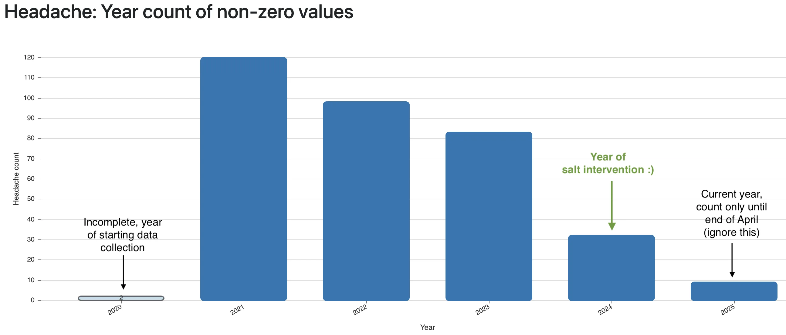
In autumn 2024, I finally picked up the term "Intermittent Explosive Disorder" again for my research even though I remembered that other than some symptom descriptions, there was nothing interesting to find online when I heard of the term first around 2022. This led me to finally write down symptoms in a structured way, long-term, every day. It’s not easy to find a metric that can be objectively measured and consequently written down each day without guessing (was my anger a 7 or a 9 out of 10??). The same applies to other symptoms, though, and fortunately I had years of experience writing down health symptoms from my migraine research (I fixed migraine to a good extent, see my article).
The first metric I started to write down daily is "inner anger" on a scale of 0-3 where 1 would be annoyed feeling, 2 stronger anger, and 3 a freakout, even if it remained only in my head.
And the second one is "nice to person XYZ" on a scale of 1-5, with both the day’s minimum (worst behavior) and maximum (best behavior) written down, so actually two metrics. I did it for multiple close people, so I had even more data. On that scale, 1 stands for screaming, wild, unfair, outrageous behavior, 2 for very unfriendly, 3 for neutral/affirmative, 4 for friendly/nice and 5 for loving/caring/understanding behavior.
Together, this means I have one internal metric that was "measurable" even if I didn’t shout or otherwise react to other people, and two metrics that define my externalizing behavior, or in other words, how bad IED actually affected my behavior towards others, not just my thoughts. It was so incredibly stupid to start the data collection so late, as I knew that the data is the most important input for finding correlations with other conditions.
What could I now do by just having some numbers of how angry and outrageous I was? Standalone, those numbers are useless. They must be correlated with, at best, possible causes. I had lots of conditions already written down for a while due to my migraine research. For example whether I was outside in the sun, did sports, took supplements and ‒ sadly only since that autumn ‒ also what I ate on each day. After a few months, I still had no clue and also didn’t find any success stories online. I tested and analyzed supplements which are supposed to help (e.g. magnesium is said to be calming), among other attempts. I spare you the details.
Histamine intolerance (HIT) is the cause, omitting histamine-rich food items the solution
I had used magnesium for years to try and combat migraine. It’s recommended for a myriad of health conditions and said to have a calming effect, improve sleep and headache, yada yada. It’s the holy grail supplement nowadays. Different magnesium salts have different effects and side effects, but for me, magnesium had exactly one outcome:
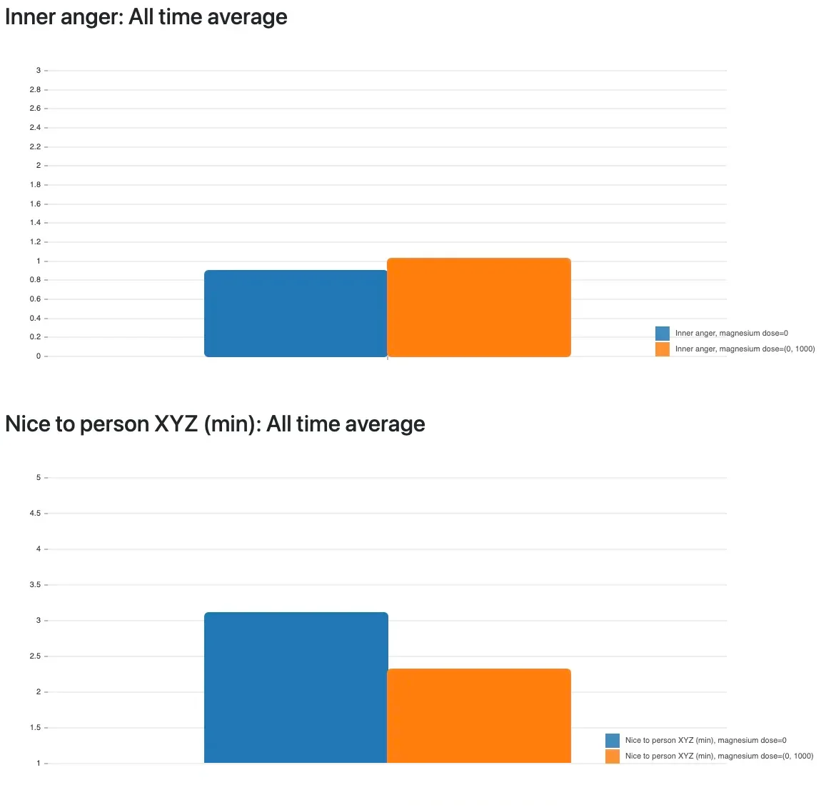
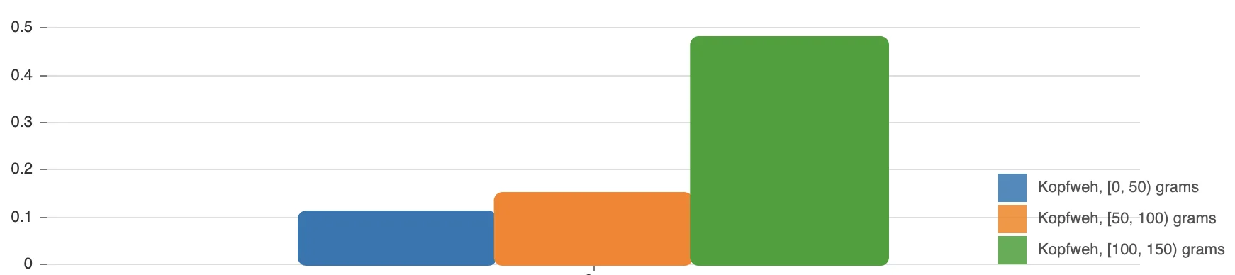
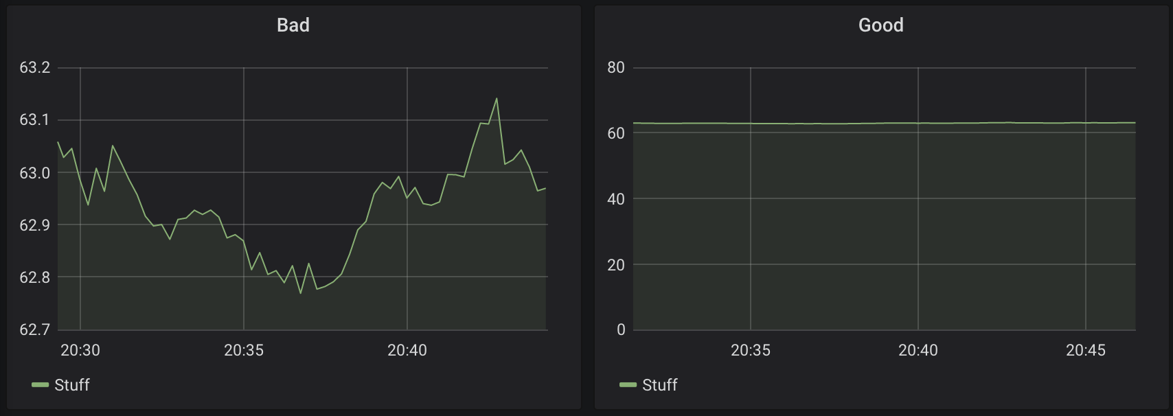
Remember my scale of being nice and friendly to "person XYZ"? It’s the main behavioral problem I wanted to improve and magnesium supplementation lowered my niceness score by 0.8 points! That’s vastly significant. (For simplicity, I combined all magnesium types and dosages into one bar in the graph since there was no difference for me.) For the "inner anger" metric, worsening can be seen as well, but it’s not very obvious, so I’m happy to have chosen an externalizing behavior metric as well. The more often I took magnesium, the longer the very bad effect lasted.
This was the first hint of effects from diet and supplements. I also tried the ketogenic diet which is effective for the more well-known mental health disorders (depression, bipolar disorder, anxiety, schizophrenia, epilepsy, etc.). In short: it didn’t help for my IED (and I might have done it wrong by miscalculating the fat ratio). After starting to write down total daily fat, protein, carbohydrates and calories to help get used to keto, I extended that at some point to write down the foods I ate. For example, my spreadsheet has one row for each meal (breakfast 1/2/3, lunch 1/2/3, dinner 1/2/3) and I’d put the cooking ingredients in there, such as "pizza with flour, tomato sauce, champignons, salami, grated gouda cheese".
After several months of recording food items, I found the first food which strongly affected my anger: my beloved peanuts. Then other nuts. Actually, almost all nuts (not all are displayed below). Shit.
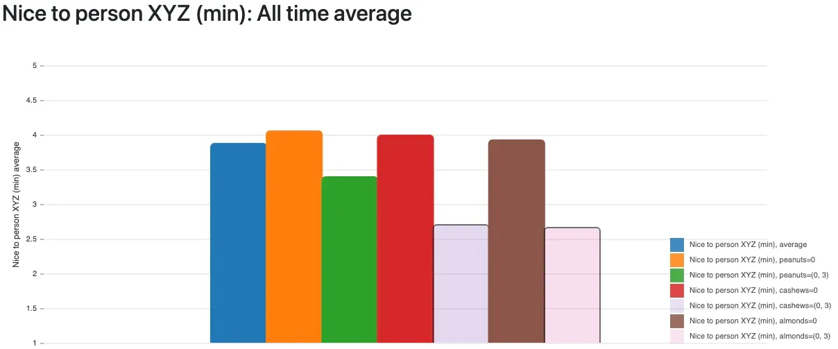
The bars for "I ate cashews/almonds" are shown transparent because they have less than 10 days of data each, but the effect is clear: these and even more types of nuts turned out as very bad triggers for my anger. Statistically, one of course has to exclude cofactors like combinations with other foods. I did that. The data didn’t lie. Ripping those favorite snacks out of my diet already helped tremendously.
I still wasn’t sure what the common denominator was, though. That turned out to be high histamine content. My "bad list" of foods grew to over 10 items after a few more weeks of research. It was all easy after getting the initial idea and the written-down data available for every day. It’s just statistical analysis and in the years before, I had already written the tool which produces the above graphs from my spreadsheet of health data (the tool will be released in a few weeks or months, I hope).
As of June 2025, my known incompatible foods were:
-
avocado
-
banana
-
blueberries
-
chocolate
-
coconut milk
-
coffee (incl. decaf)
-
cream
-
eggs
-
green salad
-
joghurt
-
kiwi
-
nuts (most probably all of them, but some I eat so rarely that I don’t have enough data; for example brazil nuts which are anyway to be eaten in very small amounts)
-
onions
-
spinache
-
tea (from the actual tea plant i.e. black/green/white tea, not herbal/fruity water)
-
vinegar and fermented foods (sauerkraut diarrhea, ewwww never again)
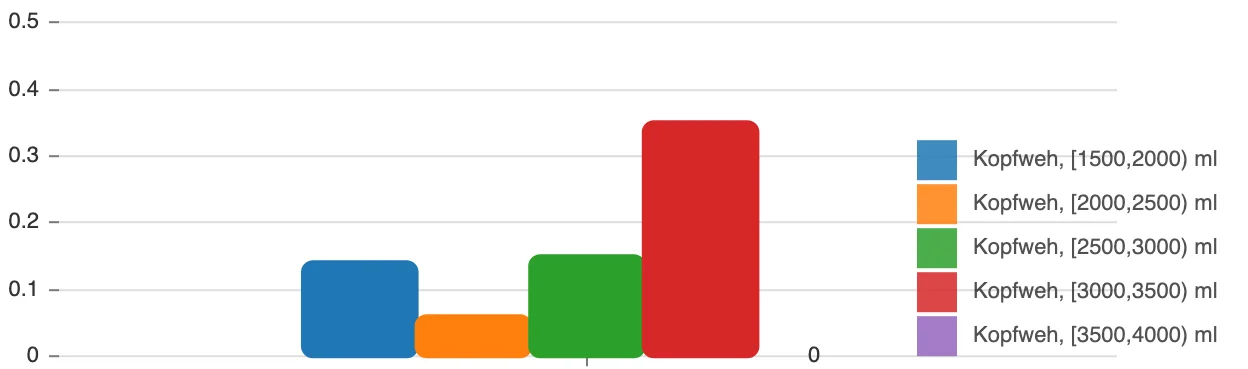
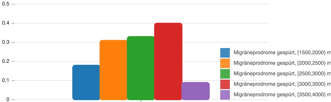
There are very few stories on the internet saying that histamine can have an effect on your mental state and behavior, but there are. And here’s mine. The data proves it. I created a metric in my statistical analysis which tracks how many of those known-incompatible foods I ate on a day, and in retrospective, the number of portions perfectly, linearly (!) correlate with anger symptoms:
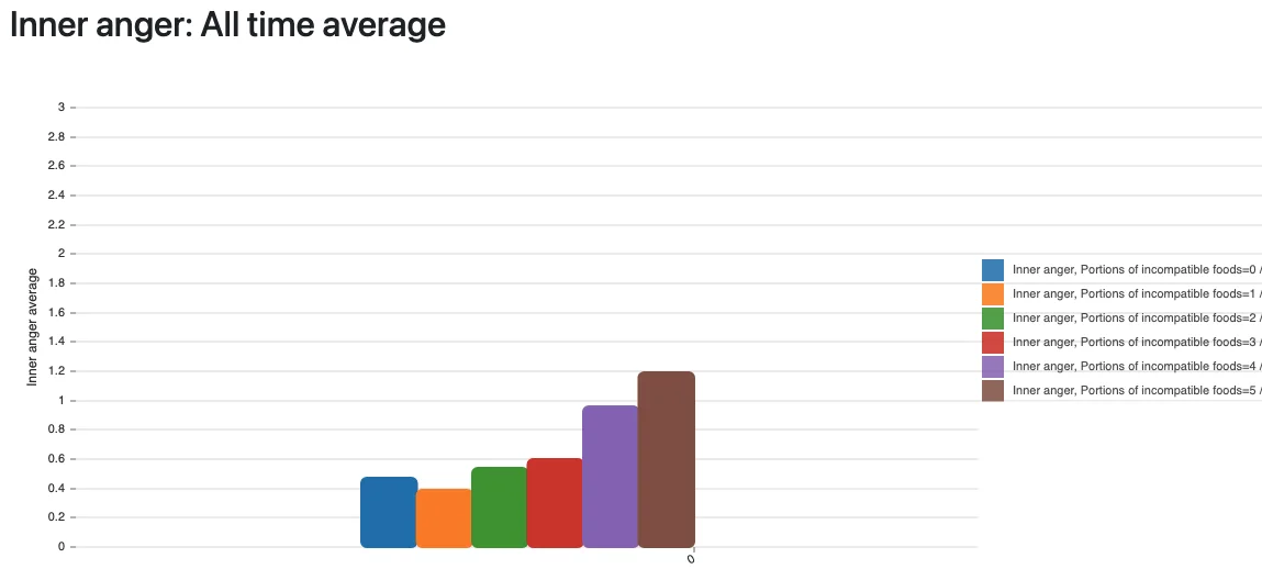
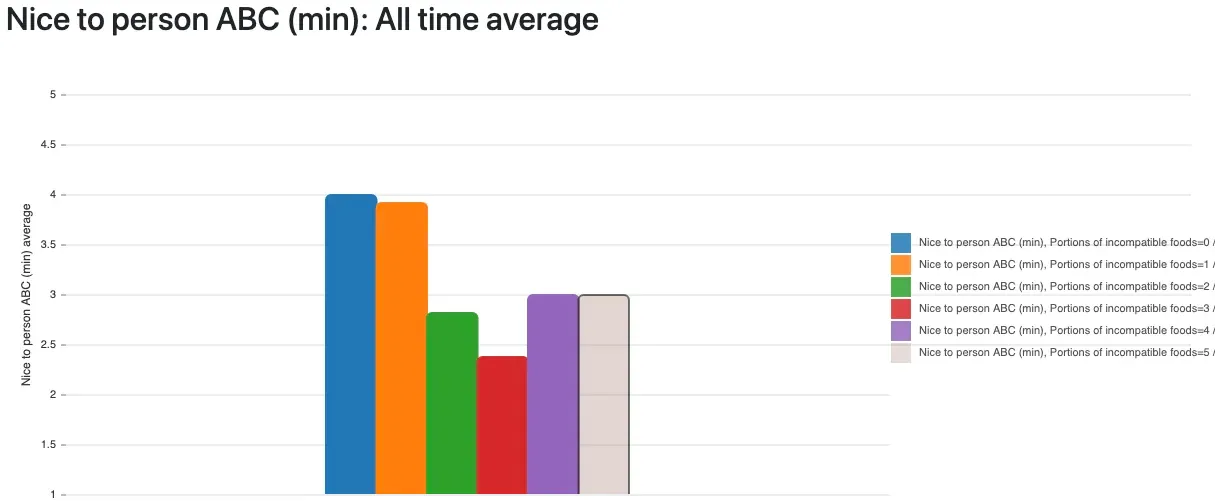
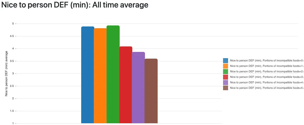
It can’t be more obvious than those graphs: all anger metrics are worse the more high-histamine foods I eat. It’s not gluten, not lactose, not some minor, usually destroyed-by-cooking toxin like oxalates ‒ it’s histamine! Histamine is in many foods, can’t be destroyed or dissolved by cooking and there are great lists available online that show which foods can have a high content.
Mind that not everyone has the same trigger foods. Tomatoes are listed on all web pages that discuss histamine intolerance, but for me, they’re actually very positive. Maybe that’s just a gift so I have at least one favorite food left that I can eat? Meat is good for me as well, luckily, because otherwise I wouldn’t know anymore what to eat to get satiated.
The above data had already convinced me, but there were more signs that hinted at histamine being the actual problem:
-
Since magnesium was extremely bad for me, which I still can’t understand today, I tried its antagonist calcium. And indeed, calcium is linearly positive regarding anger symptoms! Calcium even seems to work independently from leaving out my trigger foods. I guess that it’s because calcium is a potent antihistamine. It was used as such in the early 20th century. The effect was very easy to observe: if I have a stuffed nose and take calcium, the nose is mostly free within 20 minutes, and the effect could last up to 3 hours. Surely there might also be a risk to high calcium supplementation, so I rather consider diet the main solution for IED, and will be very considerate about using calcium at all.
-
The more incompatible foods I ate, the more my nose is stuffed. This relationship is also perfectly linear in my data. So the surrounding topic to research here is allergies. Not just food allergies, but also pollen and other triggers. I currently believe that heat is also a trigger. Start reading about "histamine intolerance" (HIT), "mast cell activation syndrome" (MCAS) and related topics, and you’ll get into a huge world of people with extreme health trouble, with various suggested solutions.
So in summary, leaving out food items and taking calcium did the trick. I’m still in full remission, no anger symptoms, after several months on this restrictive diet.
If you ask now: what if the medication has fixed the problem in the long term, and not the dietary change? No, the data and my observations were absolutely clear here. Going lower than the minimal dosage of quetiapine brought back anger symptoms latest after 36 hours. Its effect only lasts while the level remains roughly constant, which is why you need to take two pills each day. While the medication reduced symptoms to a good extent, leaving out foods had a much stronger impact, namely complete remission of symptoms. I don’t consider the medication a solution, or find it in any way comparable to the exclusion diet.
Also, I use the antihistamine cetirizine every now and then against my pollen allergy on days with a runny nose. That didn’t have an effect on the anger symptoms. It’s not surprising: antihistamine medications block certain histamine receptors, and usually not all of them; they don’t influence accumulation of histamine.
This is the end of the informative part of the article. Below you’ll find another optional section with my next steps to try and find the root cause for my body’s overreaction to, or overaccumulation of, histamine. I don’t want to miss out on great foods and drinks forever. No facts or findings in there, yet, but maybe there will be an update later. Good luck to you!
What comes after the anger is solved?
How to ensure the symptoms don’t come back? I don’t really believe in histamine intolerance as standalone problem or it being the root cause. I reckon it’s caused by something else. And I don’t want to skip eating all those great food items forever. I don’t have a clear answer yet, but the research about HIT led to SIBO (small intestinal bacterial overgrowth) as a possible cause. Since SIBO is quite widespread, the possibility for me to have it seemed high, so I did a test. SIBO is a common underlying problem of IBS (irritable bowel syndrome), but I don’t have any digestive or abdominal problems, or frequent flatulence from certain foods. Why do a test then if I don’t have the typical symptoms? Well, let’s compare that to my histamine intolerance: it’s absolutely rare to get mental symptoms from too much histamine. Most people simply get allergy symptoms like skin rashes, runny nose, itchy eyes and so on. I had regular allergy symptoms as well since I’m allergic to trees and grasses. This still doesn’t mean you can’t have other symptoms. Just because something is rare and almost completely undocumented doesn’t mean it cannot happen. I’m ready to do anything to fix my health issues long term. It’s like in software engineering: if you do it the right way, the problem doesn’t come back to you later. This explains why I wanted to test for SIBO despite not having the well-known symptoms like bloating, diarrhea and digestive issues.
The test cost around 100€ incl. return shipment of the glass vials, and debrief phone call about the results. Since doctors and insurances here don’t know or cover SIBO, I paid and did all this myself. There are several labs offering tests, even in other countries. The results turned out strongly positive for hydrogen gas production. In the article The Surprising Connection Between Histamine Intolerance and SIBO, among other sources, I found a reasonable explanation: overgrowth of bacteria in the small intestine, where naturally only a small amount of bacteria should arrive and settle, can damage the gut lining. And that in turn can lead to bad degradation of histamine by the body. There are enzymes involved in the degradation process, as you’ll read in the first 5 minutes about histamine intolerance, yet supplementing the DAO enzyme didn’t help in my case. Anyway, due to this finding, my current attempt is to fix SIBO and thereby maybe the root cause of histamine intolerance. The problem is that I don’t have anger symptoms anymore, so it’s impossible to relate the gut healing with improving symptoms. Yet I still have insomnia as very major health issue, and if my craziest theories prove to be true, then histamine keeps me from falling sleep at night, treating SIBO will fix HIT, and I’ll be happy in life 🤔. Wish me luck, since this isn’t much based on data or other people’s experiences anymore.
I’m following the recommended antimicrobial treatment: oregano oil, berberine, then probiotics, and finally gut restoration with certain supplements. I’ll update this article if it improves anything. Again: I can’t tell if anger symptoms improve since I’m in full remission already. Plus I want to reintroduce avocado, chocolate, eggs, among other items, and not fear food any longer. The exclusion diet is said to be required only temporarily for histamine intolerance, and not required long-term for everyone.
Related thoughts and reading
-
r/HistamineIntolerance has lots of stories (but almost none about mental symptoms)
-
HIT may not be the only cause of IED. In my research of the literature and online posts, correlations to ADHD (which I don’t have) appeared, and I’m sure many other causes are imaginable. There’s unfortunately barely any helpful research about causes, at least in what I found for the term "intermittent explosive disorder". Given that medication affecting serotonine or dopamine works, and histamine is now also a proven influence, it could be a complex interaction between neurotransmitter levels, still unfortunately poorly understood.
-
The SIGHI list of compatible foods is the most used, most complete listing of potentially high-histamine foods. Remember that not all of those foods may be a trigger.
-
Many great webpages exist for histamine intolerance, how mast cells work (or malfunction) and what other illnesses and symptoms that can bring
-
Overall, since scientific studies and papers didn’t show me any potential causes, I was really happy to keep using Reddit as an alternative source of information. Yes, it’s full of underwhelming, short and unexplained posts and answers by single people. But you can still get lots of ideas out of there and put them together with your own observations and theories. I must have visited dozens of subreddits with topics like antidepressive medications, depression and other mental health conditions, histamine intolerance, mast cell activation syndrome, anger, IED, etc. I highly recommend searching content on Reddit using the Google search engine and the additional search query
site:reddit.comsince Google is still the best index. Particularly the subreddit specific to IED, r/intermittentexplosive, contains barely any solutions or success stories apart from medical treatment, so I hope to be able to help some folks over there. Plus hundreds of websites for those same topics which I converted to written notes. The effort was worth it. -
Random thought: books, guides and therapists keep talking about childhood problems, trauma, abuse, the "inner child", what feeling is behind anger (hey there, cognitive-behavioral therapy!). What if functional medicine became the norm and doctors would test more people for diet or histamine-related causes? Would we find that many angry people have primarily a biochemical problem, not a psychological one?
-
I still don’t understand why magnesium is bad for my anger even at small supplement doses. Experts out there, please enlighten me because I couldn’t figure this out.