Grafana is a web-based visualization tool for observability, and also part of a whole stack of related technologies, all based on open source. You can configure various data sources — time series sources like Prometheus, databases, cloud providers, Loki, Tempo, Jaeger — and use or even combine them for your observability needs. As of April 2022, that means metrics, logs, traces, and visualizations based on those concepts. That is where dashboards come into play.
Dashboards are the typical first solution that even small companies or hobbyists can use to quickly get insights of their running software, infrastructure, network, and other data-generating things such as edge devices. In case of incidents, or for just glancing over them at will, dashboards are supposed to give a good overview to find and solve problems. Great dashboards make the difference of understanding an incident in 10 seconds vs. digging into red herrings for over 5 minutes. Meaningful dashboards also ease the path to setting correct alerts that do not wake you up unnecessarily.
On top of dashboards, you can leverage alerts, logs and tracing which together form a simple and helpful look at your stuff, if done right — or a complicated mess like your legacy software code, if done wrong 😏. Those other concepts are out of scope in this article. I only focus on how to achieve helpful, up-to-date dashboards, using private research and my production experience, where I extensively used Grafana dashboards — and also logs — to resolve incidents fast, and often with ease.
Typical examples on the internet present dashboards as a huge screen full of graphs, sometimes a collection of numbers or percentages. A lot to look at for human eyes. I will show you how to visualize better, with realistic examples. This article showcases solutions for Grafana and Prometheus, but can also be applied generically for other platforms.
Table of contents
- Goals for all your dashboards
- Spinning up a Grafana playground in a minute
- Getting started with a playground dashboard
- High-level dashboard creation guidelines
- Dashboards-as-code and GitOps (committed dashboards)
- jsonnet for dashboards — some tips
- Grafana-specific dashboard tips
- Categorize, do not make a dashboard mess
- Grouping within a dashboard
- Make dashboards editable
- Tooltip sort order
- Y axis display range
- Link to detailed dashboards, logs, other observability tools
- Use variables for repetitive values
- Clearly differentiate environments
- Grid positioning
- Choose the right data unit
- UTC timezone everywhere
- Do not rely on
defaultdata source - Heatmaps
- Display interesting events as annotations
- Self-describing visualization titles
- Observability tips not specific to Grafana
- Stay consistent in naming metrics and labels
- No need to create a metric for everything / how to easily get started monitoring an uninstrumented application
- Show only offenders or top N problematic items
- Mind test and synthetic traffic
- Daytime vs. nighttime
- Do not use
rate(…)alone - Prefer counters over gauges
- Make observed components distinguishable
- Summary
- Out of scope
- Related reading
Goals for all your dashboards
You cannot look only at best practices for a single dashboard. If you do that, you will end up with 100 dashboards, each for a single, distinct purpose, such as one per microservice. But altogether, that becomes an unmanageable mess.
Think of your company: who is the main audience of the dashboards? If you are using the "you build it, you run it" concept, it may be mostly developers (e.g. on-call engineers during an incident). For other organizational concepts, it might be SREs or infrastructure engineers. Or it may be multiple technical departments (operations + engineering). This article will focus on examples how to monitor the health of software systems (easy to apply to network and infrastructure likewise). If however your organization looks totally different and dashboards are for sales, management, compliance, information security, then the goals can be different — the article may still be helpful nevertheless. Most importantly, you as author should be part of the audience yourself, or else you are not a good fit to develop a reasonable dashboard. On the same note: great dashboards help in many ways, such as against following red herrings, but nevertheless you need application experts to resolve incidents, so those should definitely be part of the audience.
This is what we want to achieve for users:
-
Fast resolution of incidents, by finding the root cause and impacted services/customers fast
-
Users should have one browser bookmark, leading to a main, high-level dashboard. It will be the first page you open when you get called for an incident. Within seconds, it tells you which parts could be problematic, and which ones are okay (as operators in Star Trek say: "operating within normal parameters").
-
Show health at a glance, with a simple indicator that the human eyes can quickly consume (e.g. green or red background color), for each component
-
Allow drilling down into more detail (low-level) in order to come closer to the root cause if the high-level dashboard is not enough
How this can roughly work:
-
Create a high-level overview dashboard. It depends on your company how many of those make sense. The scope could be one system, service, product domain, or for small companies even the whole landscape at once.
-
Represent each component or microservice of a system in the high-level overview
-
For fine-grained analysis, it also often makes sense to create a separate, detailed (low-level) dashboard for each component. The high-level dashboard links to those.
-
From each visualization (those are the rectangles on your dashboard, such as graphs), link to detailed dashboards, prepared log queries, debugging tools on your intranet, the system/website itself, etc.
-
Create dashboards solely through code, to avoid having a mess of manually created, unreviewed, inconsistent dashboards after a few weeks, and the need for a company-wide "tooling switch" after a few months or years, only to clean up all of that. Users nevertheless get write access to Grafana, since that allows temporarily adapting a dashboard for own usage, such as special investigation during incidents. They should however be trained that changes should not be saved, and any saved changes will regularly be overwritten by the dashboards committed as code. Those get automatically deployed, for example by a CI pipeline.
-
You give no training to users. Yes, you heard right! A well-designed dashboard is 100% obvious and requires no explanation to use it, given the user knows the relevant terminology of your monitored system. Training for incidents anyway mostly happens through practice. Therefore, I recommend you present the dashboards on screen during incidents, so that other users see the capabilities they offer, and less obvious features such as the hyperlinks that can be added to the clickable top-left corner of each visualization. Code review for dashboards, and reviewers who are application experts (who understand the meaning of the displayed metrics), are essential to keep up good quality and really make the dashboards plain simple to use without explanations.
-
For medium to large companies in terms of head count, introducing such a consistent concept will be impossible unless technical leadership supports the full switch from the old or non-existing monitoring solution to Grafana with dashboards-as-code. It is key to document and communicate that codifying dashboards is the only way to go, listing the rationale for your company and also how a developer can start creating or modifying dashboards. This requires no more than one-page documentation/guide and an introduction by leadership or engineering managers.
Spinning up a Grafana playground in a minute
You only need this if you want to follow along with the blog article recommendations, play around with random sample data, and do not have a live Grafana instance with real application metrics at hand.
Some solutions exist — most of them using docker-compose — which allow you to easily and quickly spin up Grafana and data sources in a minute. Here, I describe the official devenv that Grafana developers and contributors use (see Grafana’s devenv README):
git clone --depth 1 https://github.com/grafana/grafana.git
cd grafana/devenv

# As of 2022-04, these are the instructions.
# Check `README.md` files for more information.
./setup.sh

cd ..

# See directory `devenv/docker/blocks` for more supported sources.
# "grafana" is not a source - this value ensures you don't have to
# build Grafana, and an official image is used instead.
make devenv sources=grafana,loki,prometheus

# To tear down later: `make devenv-down`
Now open http://localhost:3001/ and log in with user admin and password admin. Navigate to Explore mode on the lefthand navigation bar, choose gdev-prometheus as data source and query an example metric such as counters_logins. If it shows data, you are ready to play around.
Getting started with a playground dashboard
Mind that a good dashboard takes hours or days to create! As a start, the graphical way of clicking one together is the fastest. Once you have found out a good concept and layout, codifying it for the first time is some work, but worth the effort — more on that later.
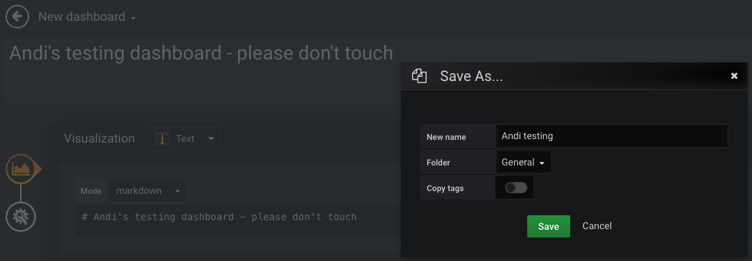
If you have to experiment on a live instance, start by adding a name and hint so that your testing dashboard will not be touched by others. You can use a text visualization for that. Save the dashboard with a meaningful name. Do not use filler words like "monitoring" or "dashboard" — of course it is a dashboard… the screenshot only does this for the temporary "it’s a test" hint in the title. Now you can follow along with the recommendations and examples in this blog post.
High-level dashboard creation guidelines
Choose main input for the high-level dashboard
By first concentrating on monitoring and alerting for the main function of your business and system, you can cover almost all critical problems in subcomponents and infrastructure resources, without having to monitor those explicitly.
That needs explanation… The business in this blog article’s example is to process payments. So if payments fail, people cannot pay, and the business is at risk. Anything else is not as important, and therefore not worth to observe as the first thing. If a critical issue arises in our systems or network, the payment_errors_total metric will most likely cover that! To use IT terminology: the metric of payment failures is a significant service level indicator (SLI).
Admittedly, that will not cover if the internet, a customer, or our API are down, because payment requests would not even reach the system and therefore cannot produce logs or error metrics. That can be covered by a metric describing the payment request rate, probably by customer and payment method, since each of those have different typical traffic rates (minimum/maximum, different per timezone or day/night, etc.). We keep this shortcoming out of scope to keep the blog article simple. The point is: choose very few, essential business metrics as a start, not technical metrics.
Often, you would select the most business-relevant Prometheus metric offered by the system you want to monitor. Metrics are stored as time series and therefore very fast to query, as opposed to logs. If you use other observability tools, such as an ELK stack, you can check if Grafana supports the relevant data source. This metric would typically pertain to the methods "RED" (requests/rate, errors, duration) or "USE" (utilization, saturation, errors). The Four Golden Signals of Google’s SRE book additionally distinguishes traffic from saturation. An error metric is a good choice to start, since it is easy to determine which error rate is acceptable, and at which threshold you would consider it a serious problem.
Throughout this blog post, we will use the following example metric and simple terminology from the payments world:
-
Imagine we are in a company that processes payments, offering different payment methods, with each of those methods (e.g. credit card, voucher, bank transfer) having a separate microservice implementation
-
Counter
payment_errors_total -
Cardinality — the counter has these labels:
-
payment_method(example valuescredit_card,voucher,bank_transfer) -
error_type(example valuesconnectivity_through_internet,remote_service_down,local_configuration_error)
-
Metric naming and cardinality
We do not want to have separate metrics credit_card_payment_errors_total and bank_transfer_payment_errors_total! If you have microservices of the same type, as in this example one service per payment method, the metrics really mean the same thing. So rather improve your consistency and use just one metric name. Easy to do if your code is structured in a monorepo, by the way. If you have inconsistent names, it will take extra effort to repeat each dashboard visualization for each of the conventions, instead of just using labels to distinguish and plot the services (or other traits that you define as label dimensions, such as customers).
Metric names should be easy to find in code, so that developers can make sense of them fast in a stressful situation, or find out if/where a metric (still) exists. Here is a bad example where the metric name mysystem_payment_errors_total cannot be found in code: for request_type in ['payment', 'refund', 'status']: prometheus.Counter(name=f’mysystem_{request_type}_errors_total') (Python pseudocode).
Avoid high-cardinality metrics (many label combinations), since those take up lots of space, and queries take longer. Like for the logging rate of your systems, you might want to check for large metrics sporadically, or you may run into unnecessary cost and performance issues.
Stat instead of Graph for human understanding within milliseconds
A graph (nowadays called Time series visualization) for our example metric, showing payment method and error type combinations, looks like this:
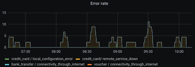
Cool graph, right? And we’re already done and have a monitored system! No, this is very, very bad! Great observability requires much more than just clicking together some visuals. The example is not sufficient to monitor a service. A graph visualization is a bad way to get an impression within milliseconds. The eyes have to scan the whole rendered graph, potentially containing multiple lines on varying bounds of the Y axis. You also need to know which thresholds are bad, or configure horizontal lines on the graph which represent warning and errors thresholds. That means lots of lines, colors, and points to look at before getting your question answered: "is this normal or do we have a problem, and where?"
Graphs can be helpful if you set them up nicely, but definitely not in the high-level part of your overview dashboard.
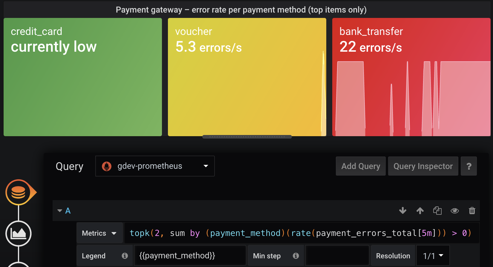
Instead, a Stat visualization, combined with traffic light colors, gives you the answer in milliseconds: green is good, amber (yellow) is noteworthy, red is bad. In addition, I tend to use blue as "noteworthy but may not be problematic" — kind of an early warning sign or unusually high amount of traffic, such as during sales/promotion seasons. So for me personally, I like the order green-blue-amber-red. Grafana allows choosing to color the background instead of the value line, which I recommend since then your whole screen should look green most of the time (click Panel > Display > Color mode > Background), and your eyes do not need to focus on the color of tiny graph lines. Exactly one value is shown — typically a number or human description.
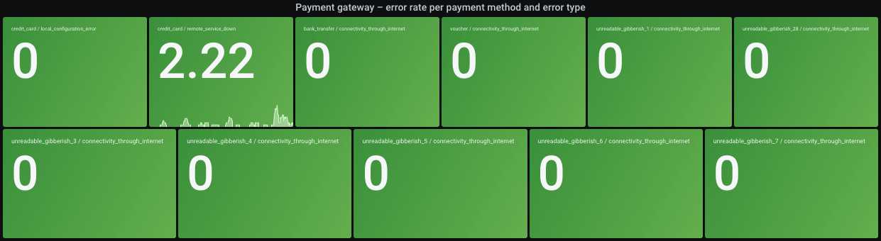
Settings for the above screenshot:
-
Prometheus query:
sum by (payment_method, error_type) (increment(payment_errors_total[2m])) -
Legend:
{{payment_method}} / {{error_type}} -
Choose Calculation > Last. That will give the latest metric value, since now is the most interesting time point to show. Aggregations such as Mean may be a useless "all problems averaged away" view if you pick a big time range such as Last 24 hours, and would therefore show different values to different people. Since the Last setting does not average at all, your query should do that instead of sampling a single raw value: Prometheus queries such as
increment(the_metric[2m]), orrate(the_metric[2m])if you prefer a consistent unit to work with, will average for you. The[2m]in there should be selected depending on how stable the metric is and how fast you need to react once the metric reaches a threshold (mind the averaging!). Magic variables like$__rate_intervalmay sound promising, but also have the issue that a different time range selection shows different results, and that could lead to confusion if you exchange links to dashboard views with other people during an incident.
To show the colors, you need to set thresholds on the Field tab. Setting them as static numbers (with the queried unit, e.g. "errors per 2 minutes") may work for the start. That is called Absolute in Grafana.
In our example though, the different payment methods and error types have very different thresholds: for instance, let’s say the credit_card payment method has remote_service_down errors very frequently because the 3rd party provider is unreliable and we cannot help it, so we want to set a higher threshold because it otherwise unnecessarily shows a problem. Or instead of a higher threshold, you could consider querying the error rate increment over 10 minutes, to even out any short spikes. To use relative thresholds, click Percentage and fill some values. They will use the Min/Max settings. For example: if you set Min = 0 and Max = 200, red background color above the 66% threshold will be shown above 66% * 200 = 132 (unit in this example: errors within 2 minutes). Everything above 66% will be red. Everything between 16% and 33% will be blue. And so on.
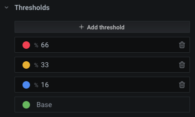
To set specific thresholds per value combination (here: "payment method / error type"), adjust Max:
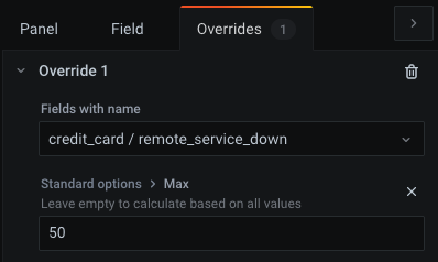
Since Grafana live-previews your changes, it should be simple to choose good values for Max. Select a healthy time range for your system, and it should be green (note that the right-most time point is displayed, as we chose Calculation > Last). Select an incident time window, and choose a Max value to make it red. The other values (amber/blue) might then just work, since they are based on percentages. Start with values that work, and adjust them if you later see false positives (red when system is fine) or false negatives (green when system has problems). If you want human descriptions instead of numbers, you can also use the override feature (Field > Value mappings, or for specific fields: Overrides > [create an override] > Add override property > Value Mappings / No value), for instance to replace 0 with the text "no errors".
Example: our query shows the number of errors in 2 minutes. By looking at the graphed data of the last few days (paste query into Explore mode), we might find that 20 errors in 2 minutes are acceptable and should be shown as green. We therefore choose a slightly higher threshold of 25 to still be within the green color. Since we switch to blue color from 16%, we get Max = 25 * 100% / 16% = 156. As a result, red background color — which shouts "something is seriously wrong" — would be shown above Max * 66% = 103 errors in 2 minutes. You should experiment a little so that in healthy times, your dashboard remains green.
Side note: for "higher is better" metrics such as customer conversion rate (100% = all customer purchases succeed), you can just turn around the colors (green on top, red on bottom). The Max setting also defines the upper bound of the graph which is shown as part of the Stat visualization, so if values are higher, the line will cross the top of the Y axis and therefore becomes invisible. Not a big deal if Min/Max cover the expected range. You may also have the rare case of "too high and too low are both bad" metrics, e.g. a counter for payment requests where you always expect some traffic to be made, but also want to be warned if the request rate is soaring. The colors could be adapted to show both low range and high range as red, with green for the expected, normal range.
Keep panels small on screen
Pack only few visualizations horizontally, so the font stays large enough. Other people may work on a smaller screen than yours, or do not use full screen sizing. The repeat feature (Panel > Repeat options) makes Grafana create and align them automatically. In our example, the repeat feature is unused, but since we pulled different combinations of payment method and error type out of our (single, consistently named and labeled) metric, that will also show multiple rectangles in one Stat visualization, and try to align them on screen. In the screenshot further above, the titles are barely readable, and the visualization is large and could require scrolling on small screens. To solve that, you could:
-
Keep as-is and show a separate rectangle for each combination. With each added or newly monitored product/feature (here: payment methods), the whole dashboard size grows, so the page does not always look the same or fit on one screen. I’m not telling you it should fit on one screen, but a high-level dashboard must not be an endless scrolling experience.
-
Show only problematic items — for instance, only yellow and worse. The downside is that in healthy cases, nothing gets shown, making users unaware of how it should normally look like. See below for a better option.
-
Show the top 10 highest error rates (Prometheus:
topk). This can be combined with traffic light coloring. If only one shows red, you will think that one payment method is down, while if multiple show red, you may think of a larger issue. With this solution, the visualization will never show as empty, so you’ll see ~10 green rectangles in healthy scenarios (the section Show only offenders or top N problematic items later explains why it may not be exactly 10, and how to fix that). Compared to the above option, this ensures that the visualization remains at the same size and does not jump around on the web page, and you know that the dashboard is still working. Just like software, dashboards can become buggy and not show you the right things, for example if someone renames a metric!
Avoid dropdowns for variable values
Typical pre-built, open source dashboards may show variables like these:

Such low-level investigation dashboards are helpful, but for high-level purposes, your dashboard should show everything at one glance. If you have clusters A and B, of which one serves traffic at a time and the other one is the passive backup, you should not be required to know by heart which cluster is active. Instead, the dashboard should show health across clusters. You can still repeat your visualizations for each cluster, or query for by (cluster) if it proves helpful — but probably rather on low-level dashboards. For our example of an error metric, you want to know if it goes above a threshold, and sum(rate(…)) does not strictly require distinction by cluster in the high-level visualizations.
Dashboards-as-code and GitOps (committed dashboards)
The Grafana provisioning documentation describes how to use a local directory which Grafana will watch and load dashboards from. However, you cannot just write dashboards as plain JSON as a human. Also, more ergonomic ways of importing dashboards, e.g. from a Git repo, are not supported yet but Grafana Labs is considering improvements.
Here is the rough plan:
-
Generate Grafana-compatible JSON containing dashboard objects. The Grafonnet library is the official way to develop dashboards using the Jsonnet language. There is also Weaveworks' grafanalib for Python which is not presented in this article.
-
Add that build to CI. Deployment means that you have to make the JSON files available to Grafana in some directory.
-
Configure Grafana to pick up files from that directory
-
Also, support a developer workflow
Advantages of not creating dashboards visually through the Grafana UI:
-
You get a developer workflow. The later section Fast develop-deploy-view cycle explains how that works. It is surely worse than WYSIWYG. But a programming language such as jsonnet makes the repetitive parts so much more expressive and consistent. With file watching tools and a Grafana API key, you can deploy each saved change within a second and only need to reload in your browser. Very soon, it will be a great experience, once you have assembled some basic functionality and learned the language. While jsonnet is not the best or most well-known language, better alternatives such as CDK integration or other libraries may arise in the future. And once you have developed a dashboard, it is easy to improve in small increments, similar to software code. In fact, just like the main parts of your software code, dashboard code will typically be written once and then not touched for a long time. Codifying dashboards therefore leads to long-term consistency, yet making large changes easy. If you tell people to visually create dashboards instead of dashboard-as-code, after a few months you will see a bloat of outdated, awful, non-informative and unreviewed dashboards, with lots of them probably unused. Coded dashboards improve quality and allow you to throw out old stuff easily and with the needed 4-eye principle. You can still allow people to visually author dashboards, but tell them they will be automatically destroyed every Deleteday. Changes can be tested visually (at best with production data!) but should then be ported back into code. Once coded, a dashboard should go through review, and it is very likely that most changes reuse homegrown jsonnet functions instead of reinventing each dashboard from scratch. Simple improvements should become one-line changes. Reviewed dashboards are much more robust, stable and avoid outdated parts.
-
Consistent annotations such as deployment events, for instance by reusing a custom function which adds them everywhere
-
With such a custom base library of functionality, nobody needs to be an expert to get started making changes to monitoring
-
Vendor lock-in can be avoided to some extent. The Grafonnet library and custom object properties are highly Grafana-specific. No way around that. Even if you use WYSIWYG editing and storage, the dashboard is stored as Grafana-specific JSON, not transferable at all to other providers. I recommend to choose one observability platform and stick with it for years — just like you would for an infrastructure platform such as Kubernetes and its ecosystem. This article shows you how to cleanly manage your dashboards as code. That way, improving or fixing all dashboards at once is done within minutes, and you get the benefit of code review. If you write some high-level jsonnet functions such as
addDashboard(prometheusQuery, yellowThreshold, redThreshold)(pseudocode), you can even abstract Grafana-specific stuff to some extent and later port more easily once the company switches to another observability provider or cloud product. I cannot provide experience or examples (yet) whether such an abstraction layer is worth the effort. -
Old and unused stuff is easy to detect and delete. For example, you can
grepfor metric names or other things that do not exist anymore in your software, and delete those dashboards or visualizations from the code. Likewise, it is easy for a developer to find out where and if a metric is actually used for monitoring. -
A monorepo keeps all observability-related things in one place. You do not want to copy the solution into every engineering team’s projects, since it may take some effort upfront to include it with your existing CI/CD/GitOps tooling, and decentralizing the solution defeats many advantages (consistency, shared base library functions, availability of good examples for new joiners to learn from). If you can reuse your software (mono)repository, even better, since that makes it easier to put relevant changes together — such as adding/removing/extending metrics or log fields.
Dashboard generation from jsonnet code using the grafonnet library
Let’s set up the generation of our dashboard from code. First, the necessary tools. jb (jsonnet-bundler) will be used as jsonnet package manager, and go-jsonnet (not the much slower C++ implementation!) for the language itself.
# macOS + Homebrew
brew install go-jsonnet jsonnet-bundler
# Any other OS / package manager combination
go install -a github.com/jsonnet-bundler/jsonnet-bundler/cmd/jb@latest
go install github.com/google/go-jsonnet/cmd/jsonnet@latest
We need jsonnet libraries for the outputs we want to generate. In this case, Grafonnet for Grafana dashboards is enough. If you want to generate non-Grafana resources, consider the kube-prometheus collection which covers much of the Kubernetes landscape (but mind its Kubernetes version compatibility matrix).
cd my/version/control/repository
jb init
jb install https://github.com/grafana/grafonnet-lib/grafonnet
echo "/vendor" >>.gitignore
Commit jsonnetfile.json and jsonnetfile.lock.json. The lock file ensures that the next user gets the same version of libraries, so you do not need to commit the downloaded modules in the vendor directory. But that probably starts a flame war among Go developers, so please decide yourself…
Instead of jb, you could also use Git submodules, but probably will regret it after adding more dependencies — I did not test that alternative.
First write a minimal dashboard as code and save as dashboards/payment-gateway.jsonnet:
local grafana = import 'grafonnet/grafana.libsonnet';

grafana.dashboard.new(
  timezone='utc',
  title='Payment gateway (high-level)',
  uid='payment-gateway',
)
.addPanel(
  grafana.text.new(
    content='Yippie',
    mode='markdown',
  ),
  gridPos={
    x: 0,
    y: 0,
    w: 24,
    h: 2,
  },
)
Play around manually:
# This may fail if you forget the newline at the end of the file, or the code is
# otherwise not compatible with jsonnetfmt's expectations
jsonnetfmt --test dashboards/payment-gateway.jsonnet || echo "ERROR: File must be reformatted" >&2 # use in CI and IDE ;)

export JSONNET_PATH="$(realpath vendor)" # same as using `-J vendor` argument for the below commands
jsonnet-lint dashboards/payment-gateway.jsonnet # use in CI and IDE ;)
jsonnet dashboards/payment-gateway.jsonnet
The last command outputs a valid Grafana dashboard as JSON. To manually apply it, open the test dashboard in your Grafana instance, then ⚙️ > JSON Model > copy-paste generated JSON > Save Changes. You should now see the dashboard as described by code — containing only a text panel that says "Yippie". This is the simplest development workflow. But it is very tiring to always go and copy-paste some generated blob and save it with many clicks. And the workflow is not visual (WYSIWYG). The next section explains a better way.
Fast develop-deploy-view cycle
While there is no WYSIWYG editor for the whole conversion from jsonnet to a visual dashboard in Grafana, here is an alternative which works right now (in 2022):
-
Create a personal API key (side bar > Configuration > API Keys) with Editor permission
-
Use entr or other file watching tool to execute a script whenever you save your jsonnet files. IDEs may offer this action-on-save feature as well.
-
That script uses your API key to overwrite dashboards in your Grafana instance
Preparation in your shell:
export GRAFANA_API_KEY="THE_API_KEY_YOU_CREATED_WITH_EDITOR_PERMISSION"
export GRAFANA_URL="THE_GRAFANA_URL" # if you use devenv: `export GRAFANA_URL="http://localhost:3001/"`
Next, store the following script as watch.sh:
#!/usr/bin/env bash
set -eu -o pipefail

error() {
	>&2 echo "ERROR:" "${@}"
	exit 1
}

[ -n "${GRAFANA_API_KEY:-}" ] || error "Invalid GRAFANA_API_KEY"
[[ "${GRAFANA_URL:-}" =~ ^https?://[^/]+/$ ]] || error "Invalid GRAFANA_URL (example: 'http://localhost:3001/' incl. slash at end)"

[ $# = 1 ] || error "Usage: $(basename "${0}") JSONNET_FILE_OF_DASHBOARD"
dashboard_jsonnet_file="${1}"

rendered_json_file="/tmp/$(basename "${dashboard_jsonnet_file%.jsonnet}").rendered.json"

cat >/tmp/render-and-upload-dashboard.sh <<-EOF
	#!/usr/bin/env bash
	set -euo pipefail
	clear

	# Render
	echo "Will render to \${2}"
	JSONNET_PATH="\$(realpath vendor)"
	export JSONNET_PATH
	jsonnet-lint "\${1}"
	jsonnet -o "\${2}" "\${1}"

	# Enable editable flag and upload via Grafana API
	cat "\${2}" \
		| jq '{"dashboard":.,"folderId":0,"overwrite":true} | .dashboard.editable = true' \
		| curl \
			--fail-with-body \
			-sS \
			-X POST \
			-H "Authorization: Bearer \${GRAFANA_API_KEY}" \
			-H "Content-Type: application/json" \
			--data-binary @- "${GRAFANA_URL}api/dashboards/db" \
		&& printf '\nDashboard uploaded at: %s\n' "$(date)" \
		|| { >&2 printf '\nERROR: Failed to upload dashboard\n'; exit 1; }
EOF
chmod +x /tmp/render-and-upload-dashboard.sh

echo "${dashboard_jsonnet_file}" | entr /tmp/render-and-upload-dashboard.sh /_ "${rendered_json_file}"
Run the script, passing the source files as argument.
# Make script executable
chmod +x watch.sh

./watch.sh dashboards/payment-gateway.jsonnet
The script listens for changes to the source file and then overwrites the dashboard in your Grafana instance with an API request. Open your Grafana instance and find the dashboard by its title. Mind that the uid field in source code must be set to a fixed value per dashboard in order to overwrite the dashboard instead of creating new ones.
This workflow gives you results within seconds and you only need to refresh in your browser to see saved changes. You may want to keep an eye on your terminal, since jsonnet is a compiled language and therefore spits out errors if you make coding mistakes.
Automatic provisioning of generated dashboards into Grafana instance
Grafana provisioning allows automatic reloading of dashboards from a certain place. We want to load the committed, generated dashboards. On the other hand, we will not fully recreate Grafana and its database on every commit to some control repository — I’d call that murder by GitOps, and the sheer idea does not sound useful, as users and their settings are stored in the database, so we do not want to manage everything as code.
We can set up Grafana in various ways: via Ansible on a single server, with containers on Docker or Kubernetes, manually run on the company’s historic Raspberry Pi in the CEO’s closet, etc. They luckily all work the same way for configuration: local files.
In the dashboard provisioning section, it says you can put "one or more YAML configuration files in the provisioning/dashboards directory". We try that with a realistic setup of Grafana, and for the sake of simplicity, we assume a GitOps model, meaning that Grafana loads dashboards from committed files. You have to adapt this article yourself to your respective setup.
The following instructions show you how to do this on a self-hosted Kubernetes setup of Grafana (see their setup instructions). As I do not have a Grafana Cloud account right now, I cannot tell if the cloud offering provides this much flexibility, or any good way of using the GitOps model — if they do, the documentation misses this important piece (as of 2022-04). We use kind to simulate a production Kubernetes cluster.
# Create Kubernetes cluster and a target namespace
kind create cluster --kubeconfig ~/.kube/config-kind
export KUBECONFIG=~/.kube/config-kind
kubectl create ns monitoring

# Install Prometheus so we have a data source to play with
helm repo add prometheus-community https://prometheus-community.github.io/helm-charts
helm upgrade --install -n monitoring prometheus prometheus-community/prometheus
To install from Grafana’s Helm chart, you need to configure it. Store the following content in grafana-values.yaml:
adminUser: admin
adminPassword: admin

# Disable persistence so all data is lost on restart. That's a little unfair to your users,
# though, so you may want to instead combine GitOps with a delete-every-Sunday concept.
# A real production setup would provide persistence, but that is out of scope for this article.
persistence:
  enabled: false

datasources:
  datasources.yaml:
    apiVersion: 1
    datasources:
      - name: prometheus
        type: prometheus
        url: http://prometheus-server
        access: server
        isDefault: true

dashboardProviders:
  dashboardproviders.yaml:
    apiVersion: 1
    providers:
      - name: default
        orgId: 1
        folder: ""
        type: file
        disableDeletion: false
        updateIntervalSeconds: 10 # how often Grafana will scan for changed dashboards
        allowUiUpdates: true
        options:
          path: /var/lib/grafana/dashboards/default
          foldersFromFilesStructure: false

rbac:
  extraRoleRules:
    # Allow k8s-sidecar image to read ConfigMap objects in same namespace
    - apiGroups: [""]
      resources: ["configmaps"]
      verbs: ["get", "watch", "list"]

extraContainers: |
  - name: collect-dashboard-configmaps-in-directory
    image: kiwigrid/k8s-sidecar:latest
    volumeMounts:
      - name: collection
        mountPath: /tmp/collection
    env:
      - name: LABEL
        value: "collect-me"
      - name: LABEL_VALUE
        value: "grafana-dashboard"
      - name: FOLDER
        value: /tmp/collection
      - name: RESOURCE
        value: configmap

extraVolumeMounts:
  # This will implicitly create an `emptyDir` volume as well (quite surprising),
  # so we do not require the value `extraContainerVolumes`.
  - name: collection
    mountPath: /var/lib/grafana/dashboards/default
    readOnly: true
And continue installation:
# Install Grafana
helm repo add grafana https://grafana.github.io/helm-charts
helm upgrade --install -f grafana-values.yaml -n monitoring grafana grafana/grafana

# Wait until the installation is ready, then keep this running in order to access
# Grafana in the browser
kubectl port-forward -n monitoring svc/grafana 7878:80
Now open http://127.0.0.1:7878/ and log in with admin:admin.
Grafana reads dashboards from a directory structure. In the Kubernetes world, we can put generated dashboards into a ConfigMap in order to mount it into the Grafana directory structure. They however have a 1 MiB limit each. An example high-level dashboard of mine takes 115 kiB when Base64-encoded, so you also will not be able to say "we can fix this problem later", since you will reach the limit very soon. We will render all dashboards into one manifest file. That YAML file will contain one ConfigMap object per dashboard. Committing that file in a GitOps fashion is easy to add in your CI (git clone && git add && git commit && git push), but that is out of scope for this article. You could also do CIOps (kubectl apply from CI; not recommended), or just rsync -r --delete if you have Grafana on physical, mutable hardware and not on Kubernetes, or whatever other way of deployment to the directory structure. Make sure you overwrite during deployment instead of only adding new files/dashboards, since deletion and cleanup of technical debt is just as important as it is for writing software. Treat your Grafana instance and database as something that gets reset regularly, from a committed state. This avoids people making manual, unreviewed edits.
As you can see in the configuration, we use k8s-sidecar to automatically collect all dashboard JSON files into one directory for use by Grafana. Each ConfigMap must have the label collect-me: grafana-dashboard to get picked up. The following script creates such ConfigMap manifests. I do not explain here how to integrate it with your specific CI tool, but that should be easy if it works locally. Save the script as render-and-configmap.sh.
#!/usr/bin/env bash
set -eu -o pipefail

error() {
	>&2 echo "ERROR:" "${@}"
	exit 1
}

[ $# = 1 ] || error "Usage: $(basename "${0}") JSONNET_FILE_OF_DASHBOARD"
dashboard_jsonnet_file="${1}"

rendered_json_file="/tmp/$(basename "${dashboard_jsonnet_file%.jsonnet}").rendered.json"

# Render
JSONNET_PATH="$(realpath vendor)"
export JSONNET_PATH
jsonnet-lint "${dashboard_jsonnet_file}"
jsonnet -o "${rendered_json_file}" "${dashboard_jsonnet_file}"

# Grafana wants `.json` file extension to pick up dashboards
kubectl create configmap "$(echo "${dashboard_jsonnet_file}" | openssl sha1)" \
	--from-file="$(basename "${dashboard_jsonnet_file%.jsonnet}").json"="${rendered_json_file}" \
	--dry-run=client -o json \
	| jq '.metadata.labels["collect-me"]="grafana-dashboard"'
Ensure you are still pointing KUBECONFIG to the desired Kubernetes cluster, and test dashboard deployment like so:
# Make script executable
chmod +x render-and-configmap.sh

./render-and-configmap.sh dashboards/payment-gateway.jsonnet | kubectl apply -n monitoring -f -
Head over to the Grafana instance running in Kubernetes, and you see that the dashboard was already loaded. Integrate this with your CI pipeline, et voilà, you have a GitOps workflow!
Once done with the cluster, you can delete it:
kind delete clusterjsonnet for dashboards — some tips
Recommendations specifically for the jsonnet language.
Distinguish environments
You will surely have different environments, such as dev/staging/prod. They have varying URLs, potentially different set of running systems, and thresholds for production not always make sense in pre-production environments. Pass --ext-str myCompanyEnv=prod to the jsonnet tool to pass in a variable which you can use inside the source code. This allows previewing dashboards with development data before a software feature even goes live, and you will have very consistent views across environments. Example usage:
assert std.extVar('myCompanyEnv') == 'dev' || std.extVar('myCompanyEnv') == 'prod';

{
  my_company_environment_config:: {
    dev: {
      environment_title: 'Development',
      prometheus_cluster_selector: 'k8s_cluster="dev.mycompany.example.com"',
    },
    prod: {
      environment_title: 'Production',
      prometheus_cluster_selector: 'k8s_cluster="prod.mycompany.example.com"',
    },
  }[std.extVar('myCompanyEnvironment')],
}
Alternatively, --ext-code-file seems also a viable option, but I have no experience with it (see external blog post Grafana dashboards and Jsonnet which showcases this parameter).
This can also be interesting if you have a dev/prod split for your Grafana instances.
Consider jsonnet as full programming language
A simple dashboard should be a matter of only few lines of code. Follow the jsonnet tutorial to learn more how to achieve that. You will see some similarities with Python, for example string formatting with %, slicing, array comprehension, modules/imports and other syntax that can make your code easier and shorter.
If you think your users are not technical enough, jsonnet may not be a good fit unless you either provide high-level functions, or replace the whole jsonnet+Grafonnet rendering idea with your own custom solution that does the same thing: output dashboard definitions as Grafana-compatible JSON.
Grafana-specific dashboard tips
Some small tips and their solution, some with jsonnet examples.
Categorize, do not make a dashboard mess
Use the folder structure to organize your dashboards. You and your colleagues will surely play around with test dashboards, and mixing them with production-ready, usable ones is not helpful. Also, particularly if you have many systems to watch, you want everything categorized for easy access. Product-unrelated dashboards, such as monitoring for Kubernetes clusters or infrastructure, can go into a separate category. Unfortunately, you cannot set the parent folder through jsonnet as of 2022-04, but it has to be achieved as part of deploying the generated dashboards.
Grouping within a dashboard
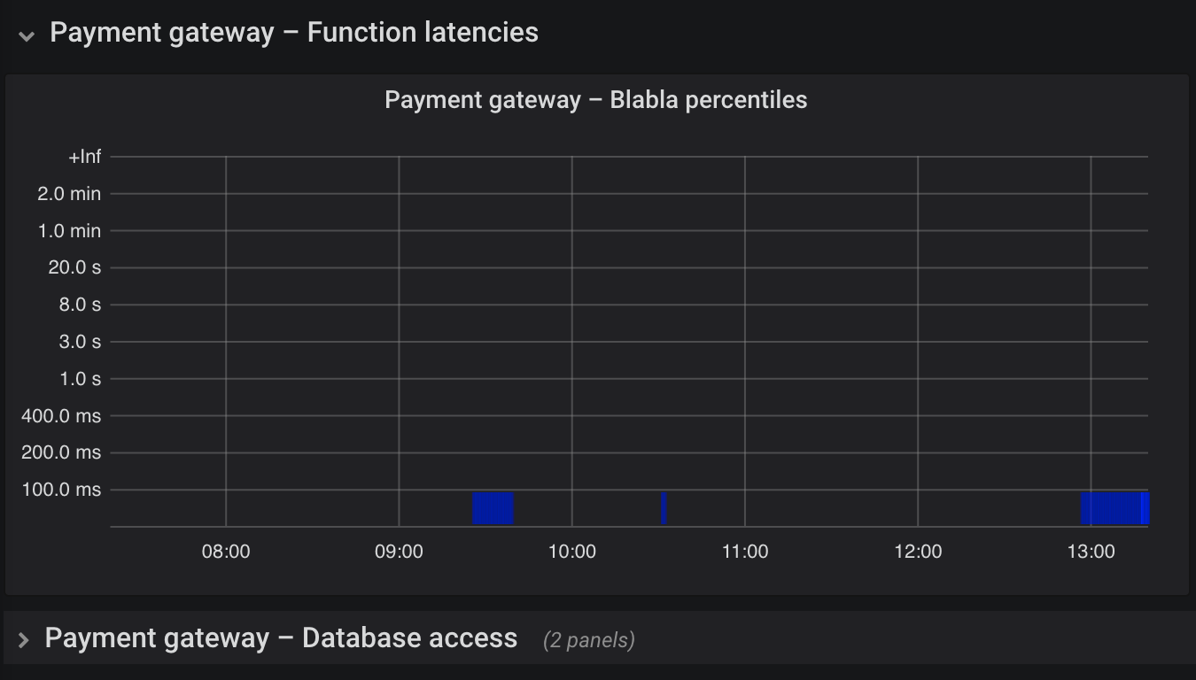
For very detailed dashboards, you may have a lot of graphs. While this is typically discouraged, your software may really have so many important metrics. In such case, group them into rows. They are collapsible and ease navigation. Maybe Grafana could consider adding a "Table of contents" feature to jump around quickly on a dashboard, using a navigation sidebar.
Make dashboards editable
In the developer workflow above, we explicitly set dashboards to editable. You may want this for the GitOps/CI workflow as well. This is helpful because incidents sometimes require a bit of playing around with shown data. Users should however not save changes, since they are supposed to be overwritten regularly by deploying dashboards from committed code.
Tooltip sort order
By default, hovering over a graph with many series shows them in a box in alphabetical order of the display label, e.g. sorted by {{customer_name}}. Typically however, such as for error rate metrics, you want the top values shown first, since the bottom of the tooltip may be cut off in case of many entries. Go to setting Display > Hover tooltip > Sort order and adjust to your liking (e.g. Decreasing). With jsonnet, use grafana.graphPanel.new(sort="decreasing") (not documented as of 2022-04).
Do not confuse the tooltip with the legend (which also has a configurable sort order!).
Y axis display range
Many metrics only produce non-negative numbers. Graphs with such a metric on the Y axis should therefore have Visualization > Axes > Y-Min set to 0 instead of auto in order to save screen space by not showing the negative area. Another problem is that you often want 0 to be the lower bound, or else Grafana chooses the display range based on the available data. In jsonnet: grafana.graphPanel.new(min=0). Setting the maximum may be helpful if you know the number range (e.g. disk full 0-100%) and want to have a consistent display.
See how the bad example on the left makes you think of a fluctuating metric. The corrected example on the right shows that in reality, the value is quite stable. In general, make trends easier to recognize for the eyes.
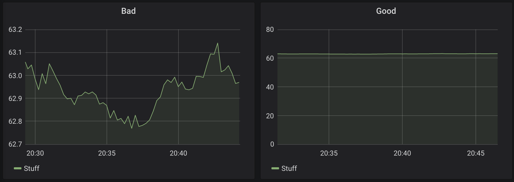
Be cautious with your use case, though. If you want to display and warn when a disk gets full, for example, you better extrapolate and display the trend. Or use a Stat visualization with a warning color once the trend reaches "disk becomes full within 30 days". The respective alerts need to be designed in a similar way. Otherwise, if a short time range is selected, the user may not see that the disk usage is going up a lot, as the difference between 200 GiB and 210 GiB may not look dramatic with Y-Min set to zero.
Link to detailed dashboards, logs, other observability tools
Use grafana.graphPanel.new(…).addLinks(…) to create panel links:
grafana.graphPanel.new(
  // ...
).addTarget(
  prometheus.target(
    // ...
  )
).addLinks([
  {
    title: 'Logs - Payment gateway',
    url: ...,
  },
  // ...
])
For links to detailed dashboards, consistently pre-select a reasonable time frame such as now-30m.
If you consistently tag dashboards, you can use dashboard links to put clickable links to related dashboards on top. You can also add external links such as other company tools. I have not used this feature yet and typically rather repeat the links on each panel since that does not require scrolling all the way to the top. With jsonnet, it is easy to provide a consistent set of links (as dashboard or panel links).
Use variables for repetitive values
In rare cases, you want a repetitive variable such as datacenter = cluster="dc"\,host=~"server.*" so that queries become less verbose: sum by (payment_method, error_type) (rate(payment_errors_total{$datacenter}[2m])). If the value is used in a label filter of a Prometheus query, as in this example, remember that commas need to be escaped with a backslash, or else Grafana treats the comma as separator between different choices for the variable value.
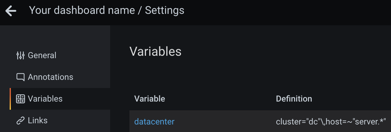
Even if you use jsonnet, you should use variables instead of filling a hardcoded value into each query. This allows users to change all visualizations on a dashboard at once (at ⚙️ > Variables).
Consider hiding those variables on the dashboard if their sole purpose is to avoid repeated, hardcoded values. See also below for some rationale.
Clearly differentiate environments
You do not want to be looking at a development dashboard while debugging a production issue, so make that mistake impossible to happen. Possible solutions:
-
Separate Grafana instance per environment. See this Reddit thread for some options.
-
Set the category and title of each dashboard so that non-production ones show a clear hint
-
Different colors and backgrounds
-
Different Grafana UI theme per environment. I am not aware of an official way to customize styles using CSS or external themes. You could patch built-in themes and build Grafana yourself, or use the Boomtheme plugin. I did not test those options. Users can change their own preference (light vs. dark), so this idea anyway does not really help unless you hardcode one fixed, customized theme. The feature request Custom UI themes discusses solutions and describes drawbacks of the available plugin.
Grid positioning
The grid position must be specified explicitly:
.addPanel(
  [...],
  gridPos={
    x: 0,
    y: 0,
    w: 24,
    h: 12,
  },
)
See Panel size and position documentation — width is split in 24 columns, height is 30 pixels each. I recommend you use 12 or 24 columns width for readability on small screens, and set a reasonable, consistent height for all visualizations on a dashboard.
As of 2022-04, you cannot easily align visualizations using jsonnet. You can hardcode x/y absolute values to your liking, but that is a hassle since you do not want to develop a user interface in an absolute grid, right? I recommend setting both to 0 in order to automatically align the visualizations on screen.
Choose the right data unit
Choose the right unit, e.g. Seconds, Requests per second, etc.
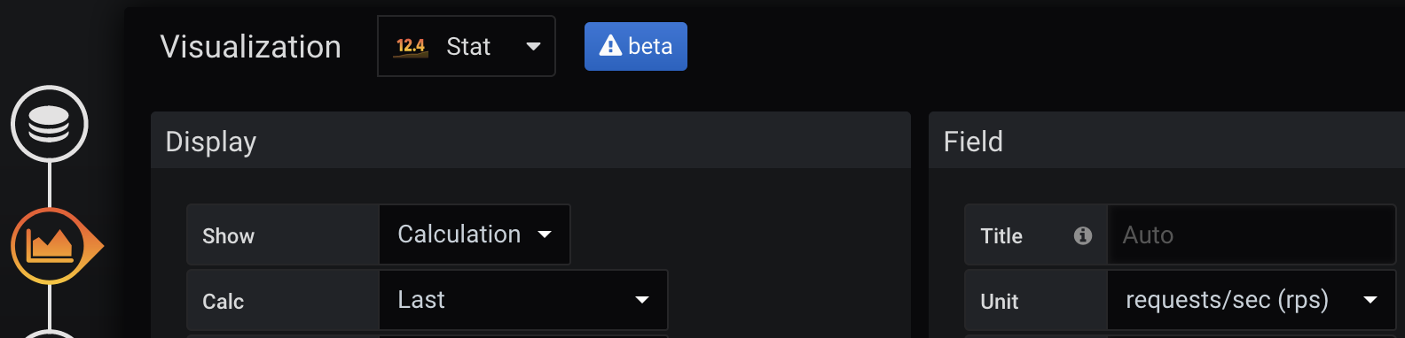
Mind subtle differences between the built-in choices, e.g. Duration / seconds will show long text such as "412 milliseconds" which makes it hard to put much information on one screen — consider using Time / seconds instead.
Also, do not confuse the order of magnitude: if your data is provided in seconds, do not choose Time / milliseconds since that would show falsified values.
UTC timezone everywhere
Grafana’s default is to use the browser timezone. Particularly for international companies or those who have international customers, consistent values and avoidance of confusion are important. Employees usually do not open the user settings page, for example to choose light/dark mode or their timezone preference, resulting in inconsistent customer and incident communication regarding dates and times. I am working from Germany and keep seeing confusion between CET/CEST once daylight saving time toggles, and sometimes even do such mistakes myself. Let’s avoid that and communicate only in UTC, and default to UTC in tools such as Grafana.
By writing a jsonnet wrapper function instead of using raw calls to grafana.dashboard.new, you can set that as your default for generated dashboards.
Somewhat related xkcd comic: ISO 8601. Did you know that the Z suffix in 2022-04-21T17:13Z stands for UTC ("Zulu time") and is therefore a pretty good abbreviation? Most non-technical people rather know the suffix "UTC", so that one is preferable.
Do not rely on default data source
Even if you rely on one Prometheus-compatible source in the beginning, you will very likely add more data sources, or migrate to another one, in the future. Therefore, explicitly define the source in each visualization. In jsonnet, use for example grafana.statPanel.new(datasource='thanos'). In general, do not ever name something default, anywhere. The same applies to the words "old" and "new", since "new" is always the next "old".
Heatmaps
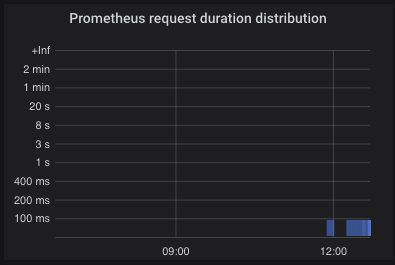
Those are hard to set up since the UI does not give guidance. You have to set several options correctly to see reasonable results:
-
Prometheus query example:
sum by (le) (increase(prometheus_http_request_duration_seconds_bucket[1m])) -
Query > Format: Set to Heatmap instead of Time series
-
Visualization: Choose type Heatmap
-
Visualization > Y Axis > Data format: Time series buckets
-
Visualization > Y Axis > Unit: Choose according to the metric, typically seconds (s)
-
Visualization > Y Axis > Decimals: For seconds (s) or other time unit, use 0 decimals, as Grafana automatically shows the appropriate text "ms"/"s"/"min", so the
.0decimal after each axis label is useless. This would best be fixed within Grafana source code. -
The Y axis will only be sorted numerically once you change the query legend to
{{le}} -
Visualization > Display > Colors: I recommend opacity-based coloring with full blue (
rgb(0,0,255)) as strongest color, in order to see things without getting eye strain or having to come close to the monitor. Use a color that is visible with light and dark theme. I would love to see the thresholds feature for the heatmap visualization as well, so that good values can be colored green, and bad ones yellow or red. Right now, colors are assigned by how often a value range ("bucket") appeared, not by the value itself — that means your eyes have to rest on the visualization for some seconds to understand it. -
Visualization > Tooltip: Enable, and optionally show the histogram for fast interpretation of the value distribution on mouseover
-
This option seems not available through the UI anymore for Prometheus data sources, but let me put this here for the record: if the visualization is showing too detailed information (too many faded bars), limit Query > Query options > Max data points to e.g. 24.
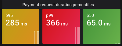
Instead of a histogram, laying out the information as percentiles on a Stat visualization may give a faster overview and is preferable on high-level dashboards. For example, p50 (median), p95 and p99 percentiles are often useful. Make sure you use the rate function inside histogram_quantile.
Example Prometheus query: histogram_quantile(0.95, sum(rate(prometheus_http_request_duration_seconds_bucket[2m])) by (le))
Display interesting events as annotations
Grafana annotations can mark interesting time points on graphs. Among many imaginable events to enrich on your dashboards, software and infrastructure deployments are the most interesting ones since change in a technology-driven company usually means risk and the potential for failure. In an incident, the starting point is often known quite soon by looking at dashboards. If graphs additionally show whether and when changes were made, you have better chances to find the cause.
Do not bother adding annotations manually (e.g. time window of every deployment), since people will forget the procedure, get the timezone wrong, and it only adds an unnecessary burden which should be automated.
Here is an example how to consistently show Argo CD sync events on your dashboards. Those mostly relate to real deployments. When I developed that query, no better, human-level event type was available. You may want to tweak this to your own use cases.
local grafana = import 'grafonnet/grafana.libsonnet';

{
  deployments:: grafana.annotation.datasource(
    name='Deployments related to payment methods and their infrastructure',
    datasource='loki',
    expr=|||
      {app_kubernetes_io_name="argocd-application-controller"}
      |~ "reason=(OperationStarted|ResourceUpdated)"
      | logfmt
      | dest_namespace =~ "payment-methods|ingress-nginx"
        and
        msg =~ "(?i).*?(?:initiated.*(?:sync|rollback)|sync status: OutOfSync -> Synced|health status: Progressing ->).*"
      | line_format `App {{.application}}, namespace {{.dest_namespace}}, cluster {{.cluster}}: {{.msg}}`
    |||,
    iconColor='blue',
  ),
}
You can now use grafana.dashboard.new(…).addAnnotation(deployments) to add the annotations to your dashboard.
Self-describing visualization titles
Each visualization’s title should be self-describing. Bad: "Error rate". Good: "Payment methods — error rate of requests to provider".
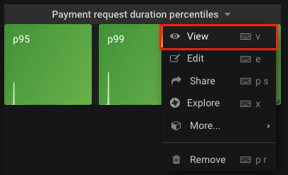
One reason is because you can link to a single visualization which is helpful during incidents to tell others what exactly you are looking at (or to present one detail on a really large TV):
And again, it helps the eyes to quickly get a full picture instead of having to look at multiple locations on screen.
In Grafana, the dashboard title is always displayed, even for such single-visualization URLs. So if your dashboard is nicely titled "Payment gateway (high-level)", that will already be a good starting point and you may not even need or want verbose visualization titles.
For averaging queries like sum(rate(metric[5m])), which may constitute most of your dashboards, you should consider adding the interval hint (e.g. abbreviated [5m]) to the visualization title — and/or the Y axis — so that users are aware how fast a recovered metric or an error peak will become visible.
Observability tips not specific to Grafana
These tips relate for example to Prometheus query practices and other things that do not require Grafana in the monitoring stack per se.
Stay consistent in naming metrics and labels
The Prometheus naming practices page gives very good guidance, such as to use lower_snake_case, name counters xxx_total or specify the unit such as xxx_seconds.
No need to create a metric for everything / how to easily get started monitoring an uninstrumented application
The 3 current pillars of observability — metrics, logs and traces — may not remain considered the best solution forever. We can expect tooling to try and combine them in the future, such as "metrics from logs" features. You want to observe your applications with minimum instrumentation effort? Then sometimes, a LogQL query such as sum(count_over_time(… [15m])) to look for specific log lines may be what you want (temporarily), instead of developing and maintaining a new metric. Beware however that log text tends to change much more frequently than metric names, and how much slower and more expensive it is to query logs. A totally uninstrumented application can easily be monitored if you have access to its logs. Later on, you can make the dashboards more efficient once you learned which indicators are important to show the application health, and which ones are not. Very helpful if you are just getting started with observability.
Show only offenders or top N problematic items
You can use > 0 or topk(…) > 5 to display only offenders in your high-level dashboard (please also read Keep panels small on screen above).
For example, the customers with the highest concurrency of API requests. Use Value mappings feature to map "null" to e.g. "currently low concurrency" for better understanding in humans (since Stat visualizations always show something). Together with green/yellow/red thresholds, this explains in 2 seconds what the current value is and whether it is problematic. As explained before, use Calculation > Last if only the latest value is relevant — you do not care about the Average API concurrency over 3 hours while debugging an incident, right?
In our payment example, we could alternatively show the payment methods with the highest rate of errors. Or depending on the business, define each payment method’s business importance in code and then only show the most critical products with a label filter (e.g. importance="boss_says_this_is_super_critical"; or name them "Tier1", "Tier2", etc.).
Note that topk(5, …) may not show you the top 5 items if evaluated for a graph, since the "top 5" are checked for many time points and all resulting items are shown. The same applies to Stat visualizations — unless you choose Instant to only choose the end time point, but that can falsify the desired data to show. If you really want only up to 5 items to be shown, use the @ end() modifier to evaluate only the latest top-5 values in the range (thanks to a blog reader for pointing this out! – available since Prometheus v2.25.0).
Mind test and synthetic traffic
In a modern infrastructure, you might run synthetic test traffic to verify the end-to-end health of your applications. Since those are not from real customers, you should check if that should be shown differently or excluded from certain dashboards or visualizations.
Daytime vs. nighttime
If your business is mostly in a certain region or timezone of the world, such as European payments, traffic goes down at night. Consider different error and request thresholds at day and night, respectively. Visualizations should be clearly distinguished with e.g. 🔆 or 🌒 in the title.
Prometheus allows the time distinction with and/unless hour() >=6 <21. This can be tricky, though: in special cases such as calculations sum(…)/sum(…) and hour() >=6 <21, label set matching will surprise you with an empty result. Example to fix that: (sum by (something) (rate(some_metric[15m]))) / sum by (something) (rate(some_metric2[15m])) and ignoring(something) hour() >=6 <21.
This is cumbersome and should be avoided for the start, unless you really need such a strong distinction by time.
Do not use rate(…) alone
The same applies to calculations like rate(…) / rate(…). Why? Any change to the labels will make them explode into many series. Combine rate with sum or sum by.
Prefer counters over gauges
A counter in Prometheus represents a value that can only increase. In contrast, a gauge can take an arbitrary value.
In regular scrape intervals, a metric’s value gets collected by Prometheus. A longer scrape interval means less storage and cost, but can mean that a short spike of a gauge’s value is not stored at all, and therefore also will not produce an alert. So prefer a counter if possible for your for use case, since its value does not lose increments (but on the other hand, it only supports increments).
Good example for using a gauge: queue size. Items can be processed, i.e. removed from the queue, or added. The more interesting metrics for queues however are error rate and per-item processing time.
Make observed components distinguishable
To find a root cause quickly in case of problems, dashboards must allow drilling down into details. In our example of payment methods as products, each of them could fail separately, or several/all at once. This must be visible in visualizations and alert messages.
Examples why this distinction is important:
-
1 payment method failing — only that application’s code might be affected, for example from a bad change recently deployed
-
Multiple payment methods failing — perhaps those have something in common, such as serving traffic from a certain cloud region or Kubernetes cluster, or which are otherwise special (in the middle of a migration, feature toggled, traffic pattern changed, rate limit of database reached, etc.)
-
All payment methods failing — bad code change affecting all those applications was introduced, networking issues, infrastructure down, other catastrophic scenario
Other ideas for details to drill down into: per customer, per Kubernetes cluster, per cloud region, per API endpoint. For some of these, you may be able to leverage variables (mind Avoid dropdowns for variable values), while some value ranges may simply be too large — for instance if you have a million customers — and you should rather show the top N problematic ones (Show only offenders or top N problematic items).
Summary
I showed how high-level dashboards and main business metrics cover most of your monitoring and incident resolution needs. On top of that, the article explains the advantages of dashboards as code and how to apply that concept, using jsonnet, the Grafonnet library and working scripts to integrate in your developer and CI/CD/GitOps workflow. Lastly, I listed the best practices for dashboard creation and visualization so that your monitoring becomes easier and faster to use.
Out of scope
-
Detailed relation to logs, traces, alerting, and other tools. Great dashboards can help you shape alerting — particularly, I mean that if you have built an understandable and quickly navigable dashboard without any clutter, then alerts should cover those observed areas. For example, if your revenue is driven by successful outcomes of payments, that should be on your main dashboard of the payment gateway, and represented in alerts. Such a high-level alert can replace a hundred fine-grained alerts. How? Here’s an example alert: "for payment method SuperFastPay, alert if there are more than 50 failed payments per minute" (set this value based on an expected failure rate). Once such an alert is received, and the on-call engineer opens the main dashboard, or the SuperFastPay-specific dashboard (if that even makes sense), it should show red for that component. The detailed dashboard may show things like failure type statistics based on metrics, or the most common recent errors in logs. If it shows you mainly internet/connectivity issues, follow your way to the payment logs and infrastructure dashboards, for example (which at best would be linked). In the end, you may find that one of your cloud availability zones A/B/C, in which the software runs, does not have internet access. And that only by getting alerted about the most important business symptom, not because you had put large effort into monitoring internet connectivity from those availability zones. If only your dashboards make sense, allowing you to navigate quickly from symptom to root cause, you can probably live with fewer alert definitions overall. This example is not from production, but a wild dream of mine if all the suggestions are optimally applied. Surely you still want alerts for symptoms in infrastructure/platform/network, particularly if the company reaches a scale where those are handled by separate teams, but those alerts then may not need highest priority ("P1") — while business-critical symptoms like failing payments of your customers should be P1 alerts. The fewer high priority alerts you have, the better people’s work life, sleep and therefore productivity will be.
-
How hard it is to convince people of doing dashboards in code. There are very valid points against it, such as the missing WYSIWYG support as of 2022-04. Those can mostly be resolved with good tooling or a reasonable "how to develop a dashboard" README file. Other concerns are often just opinionated, and you will simply need to take the decision "do we allow it to become a mess or not". I recommend vendors to make codifying resources easier, so that even less technical people will be able to work with this concept. Exporting a visually-crafted dashboard to JSON is unfortunately not a solution, since that diminishes many of the advantages explained in this article (such as consistency).
-
The article is all about live monitoring of a service/system which could have incidents at any time. For example, an API serving requests for customers. There are lots of other use cases where monitoring, alerting and tracing may help, such as performance issues, SLOs, business statistics and intelligence.
-
Accessibility / color blindness support. Red and green may not be the best options, but I do not have the experience to give help here.
-
Installation and maintenance of the observability stack does not belong in this article. Dashboards are most helpful if you can also look at historical data and not only use them for short-term review of incidents. Therefore, prefer using long-term storage such as Thanos or Cortex (and since recently in March 2022: Mimir). Those solutions provide a very good backup solution as well.
-
The current jsonnet+Grafonnet solution for generated dashboards is not the final stage of evolution. Tooling like CDK could be adapted so dashboards can be written in a Grafana-agnostic way, using great languages like TypeScript. For now, if you go with jsonnet, I recommend you implement common functions that abstract the Grafana details away and set reasonable defaults everywhere.
-
Observing only the main business metric(s) is not sufficient. Particularly when you have split into several engineering teams or even have a platform infrastructure / DevOps / SRE team, specific monitoring depending on the teams' respective responsibility makes a lot of sense. In our example business, watching the health of partner or provider companies can make sense, since they may not have the most modern health monitoring in place. For examples, Grafana Labs has acquired k6 which can be used for load tests, but in the future hopefully also to monitor TLS certificate expiry (until that feature exists, Blackbox exporter is a reasonable tool). Try a "pre-mortem" brainstorming session to think of what could go wrong, and you will find many things to monitor which are not covered by the main metrics. Consider also "value under threshold" checks, since an error rate of zero could simply come from zero requests per second, and that can mean a whole service or feature is not working, or customers cannot reach your API.
-
Recommendations in this article were collected mainly in 2020-2021, before Tempo/tracing, exemplars and k6 were in wide-spread use. All these can prove helpful in combination with metrics-based monitoring.
-
Training. As mentioned, I think a good solution survives without training, but instead has proper and concise documentation, and the code speaks for itself. There are very few professional training and recommendation videos on the internet around dashboarding, and the available beginner content often showcases "The more metrics/graphs on a dashboard, the better" 😬. I cannot disagree more, so please try my "high-level dashboard + most important business metric" approach first and see if you prefer that, or rather a jungle of messy, unreviewed stuff which fosters a useless and long-winded tooling replacement every 2-3 years. See also the Grafana webinar Getting started with Grafana dashboard design for a gentle introduction which requires less upfront knowledge about Grafana compared to my article. The video however has some examples where dashboards are too crowded for my taste.
-
Advanced observability features. Grafana and its competitors offer quite interesting features such as anomaly detection (Datadog) (also possible with Prometheus — interesting blog post), error/crash tracking (Sentry) and others. Those deserve a place on dashboards if reasonably applicable to your products.
-
Auto-deletion of manually authored changes: Remember my term Deleteday from above? Make sure to implement that. At best, your deployment from CI simply takes care to replace all existing dashboards, including those not created by code. Think of the deployment like
rsync -a --delete committed-dashboards production-grafana-instance.
Related reading
-
Fool-Proof Kubernetes Dashboards for Sleep-Deprived Oncalls - David Kaltschmidt, Grafana Labs explains maturity levels of using dashboards, and provides other ideas than my article. I did not take any ideas from that talk, as I had watched it only later, so it is a very interesting addition.
-
Google SRE book: Being On-Call chapter contains many important points, including why stress and cognitive load for humans on-call must be reduced by any means, for the sake of both employee and company health. I recommend skimming through all parts of the free book which seem relevant for you (even if you now scream "We are not Google!").
-
There are many links to Grafana documentation and other tools within this article. Give them a read, and look for realistic examples that you can try.